Introduction
Meet UrbanGrill, a beloved local street food vendor nestled in the vibrant city of Las Pinas, Philippines. Committed to providing affordable and delicious street food options, UrbanGrill has become a go-to destination for food enthusiasts in search of quick and satisfying bites.
By seamlessly bridging the gap between hunger and convenience, the UrbanGrill app aims to revolutionize the way people indulge in delectable street food, bringing the flavors of the Philippines right to their fingertips.
The Problem
Busy workers, commuters, and individuals constrained by time struggle to find convenient meal options that cater to their fast-paced lifestyles. The need for a quick and hassle-free food experience has become increasingly apparent in their daily lives.
The Goal
The objective is to design a user-friendly app that simplifies the process of ordering fresh and delectable street food. With this app, users will have the convenience of easily selecting their favorite street food and having them delivered right to their doorstep or their preferred location.
My Role
As a UX Designer, I played a pivotal role in designing the app from conception to delivery. I'm responsible for crafting the user experience, ensuring a seamless journey for users from the moment they open the app to the successful delivery of their orders.
My Responsibilities
Conducting user interviews, creating wireframes (paper and digital), developing high and low prototypes for testing, conducting usability studies, ensuring accessibility were incorporated in the design, and iterating based on user feedback.
Understanding the User
User Research Summary
To better understand the needs of the users I was designing for, I conducted interviews and employed empathy maps. This research revealed a primary user group consisting of working adults and students who faced challenges in finding time to cook meals or leave their campuses. While this confirmed our initial assumptions about UrbanGrill customers, a deeper investigation uncovered additional user problems. These included various obligations, interests, and challenges that made it difficult for them to purchase snacks or visit restaurants in person, highlighting the need for a convenient and accessible food solution.
Time Constraints
Busy working professionals and students face time limitations that make it challenging for them to dedicate sufficient time to meal preparation.
Restrictions
Work-from-home parents and students encounter difficulties in leaving their houses or campus to purchase snacks, seeking convenient options that cater to their need for quick and accessible food options.
Accessibilities
Inaccessible locations or physical disabilities can hinder users from going out to buy food, causing frustration. This limitation may result in a negative experience as individuals face challenges in accessing essential services.
User Personas
User Journey Map
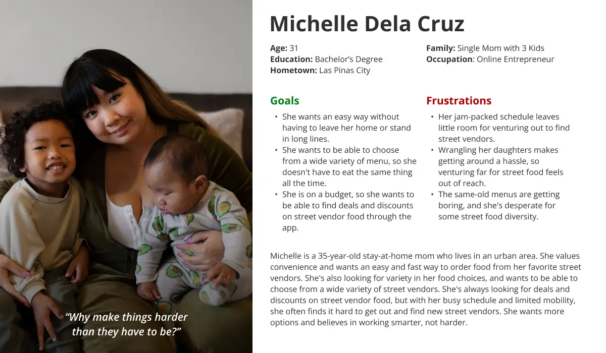
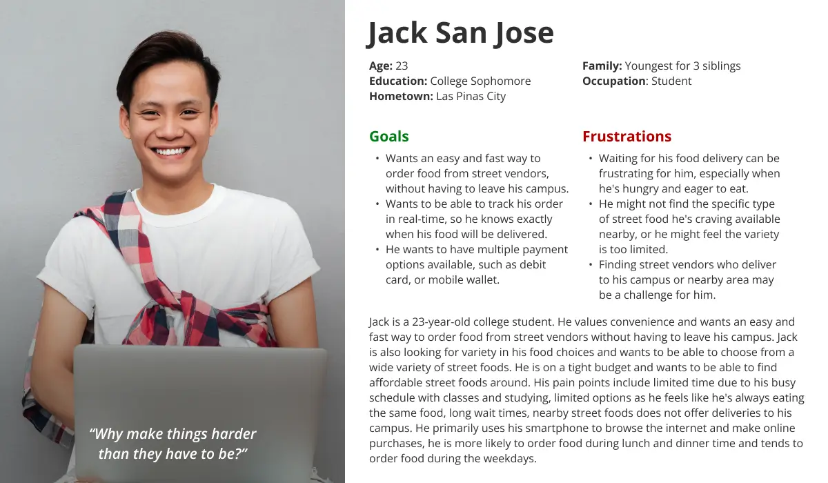
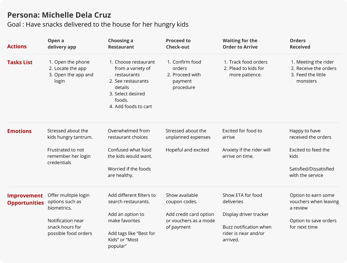
By mapping Michelle's user journey, it became evident how advantageous it would be for users to have a dedicated UrbanGrill app. The app would offer convenience and easy access to the services and features provided by UrbanGrill, making their experience more seamless and enjoyable
Start the Design
Paper Wireframe
I tried creating different designs with different ideas for the user. But later decided to use my ideas with Grab, a famous delivery app in the Philippines. The reason is that most users are already familiar with how to navigate Grab’s application as it’s the most common food delivery app. I just added a few tweaks that I believe would be better for our own target users.

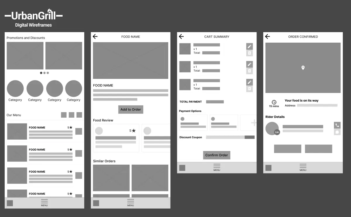
Digital Wireframes
I tried creating different designs with different ideas for the user. But later decided to use my ideas with Grab, a globally well-know delivery app. The reason is that most users are already familiar with how to navigate Grab’s application as it’s the most common food delivery app. I just added a few tweaks that I believe would be better for our own target users.
Low-Fidelity Prototype
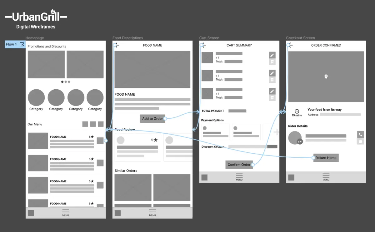
I tried creating different designs with different ideas for the user. But later decided to use my ideas with Grab, a famous delivery app in the Philippines. The reason is that most users are already familiar with how to navigate Grab’s application as it’s the most common food delivery app. I just added a few tweaks that I believe would be better for our own target users.
Usability Study: Findings
I conducted a series of 5 usability studies to gather insights from users. The findings from the first study played a crucial role in guiding the evolution of designs from wireframes to mockups, incorporating valuable user feedback. The second study utilized a low-fidelity prototype, which allowed us to identify specific areas of the mockups that required refinement and further improvement based on user interactions and feedback.
Round 1 Findings
- Clunky Homepage
- Confusing Ordering Process
- Confusing Payment Options
Round 2 Findings
- Hard to navigate menus
- Lack of other login options
- Checkout page lacking important information
Refining the Design
Mockups
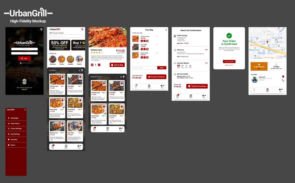
In response to user feedback, I improved the food item display in my UI/UX portfolio. Originally, each row showed only one item, but after a usability study, I switched to a grid layout. This change allows users to easily scan multiple food items. I also optimized the thumbnails by including only necessary information. This enhances the user experience and ensures recruiters will be impressed with the design.
To improve user clarity, I also separated the cart and checkout details into distinct pages in my UI/UX portfolio. This allows users to easily identify their current step in the process. I also included more relevant information to assist users throughout their journey. This streamlined approach enhances usability and showcases my attention to detail in delivering a user-friendly interface.

High-Fidelity Protoype
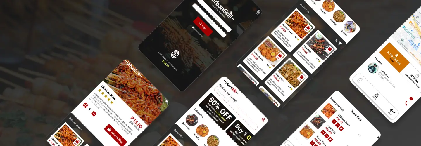
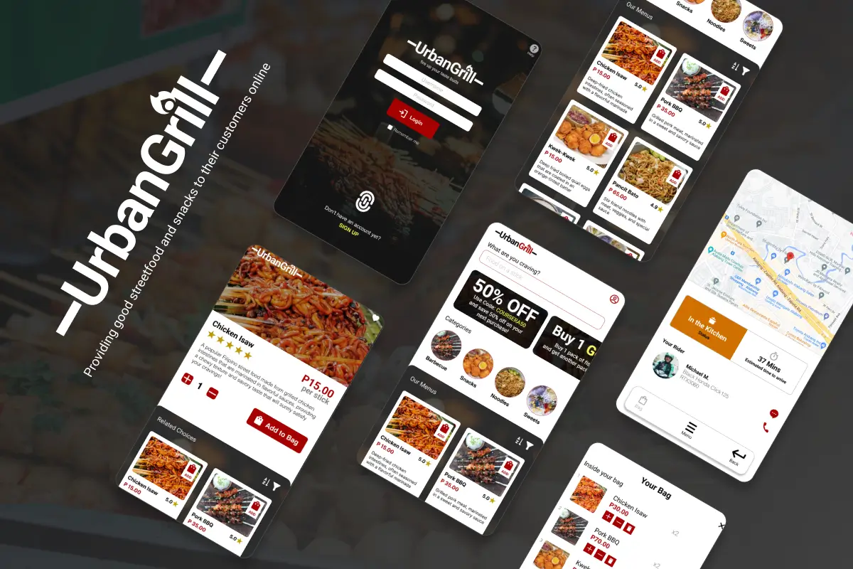
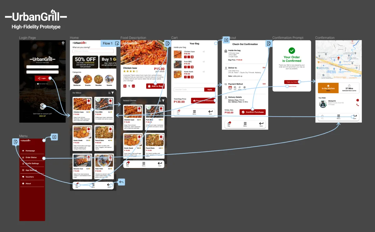
The final high-fidelity prototype in my UI/UX portfolio demonstrated cleaner user flows for ordering street foods and checkout. It effectively addressed user needs, particularly in terms of providing a seamless delivery option.
Accessibility Considerations
The design incorporates WCAG Guidelines for accessibility, but there's room for improvement. A stance toward refining accessibility features reflects an ongoing commitment to enhancing the user experience for diverse needs and can be applied as the design is being improved.
- Provided alt text for images to support screen readers and improve accessibility for visually impaired users.
- Consider in adding light/dark mode and adjustable contrast and text size options for enhanced user customization.
- Incorporate Tagalog/English language options to cater to a wider user base.
- Implement detailed imagery for the menu to enhance user understanding of food choices.
- Utilized intuitive icons for navigation to improve usability and familiarity.
Going Forward
The Impact
The app demonstrates UrbanGrill's genuine concern and thoughtful approach in meeting the users' needs, fostering a sense of care and attentiveness towards their experience.
What I learned
During the app design process, I gained valuable insights regarding the significance of research and prioritizing user needs as a foundation for design. By understanding user requirements from the outset, I was able to streamline the ideation process and develop innovative features to address their specific problems. I also recognized the importance of leveraging existing interface conventions and not reinventing the wheel unnecessarily, users generally find it easier to navigate interfaces they are already familiar with. I also expanded my knowledge on improving accessibility through the integration of sounds and visuals, thereby catering to a wider range of user abilities. This realization opened up new avenues for creating inclusive designs that provide enhanced usability and a more enjoyable user experience.
The Next Steps
Ideally, it is crucial to conduct another round of usability studies to validate whether the pain points identified in the previous design have been effectively addressed. Ongoing research should be prioritized to gain insights from users actively using the application, enabling the identification of any new areas for improvement. This approach ensures continuous refinement of the design based on user feedback and evolving user needs. Skill wise, I should utilize components in Figma more especially in prototyping to make prototyping more effecient and organized.
