Introduction
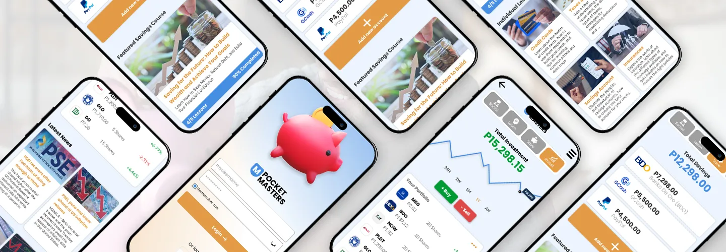
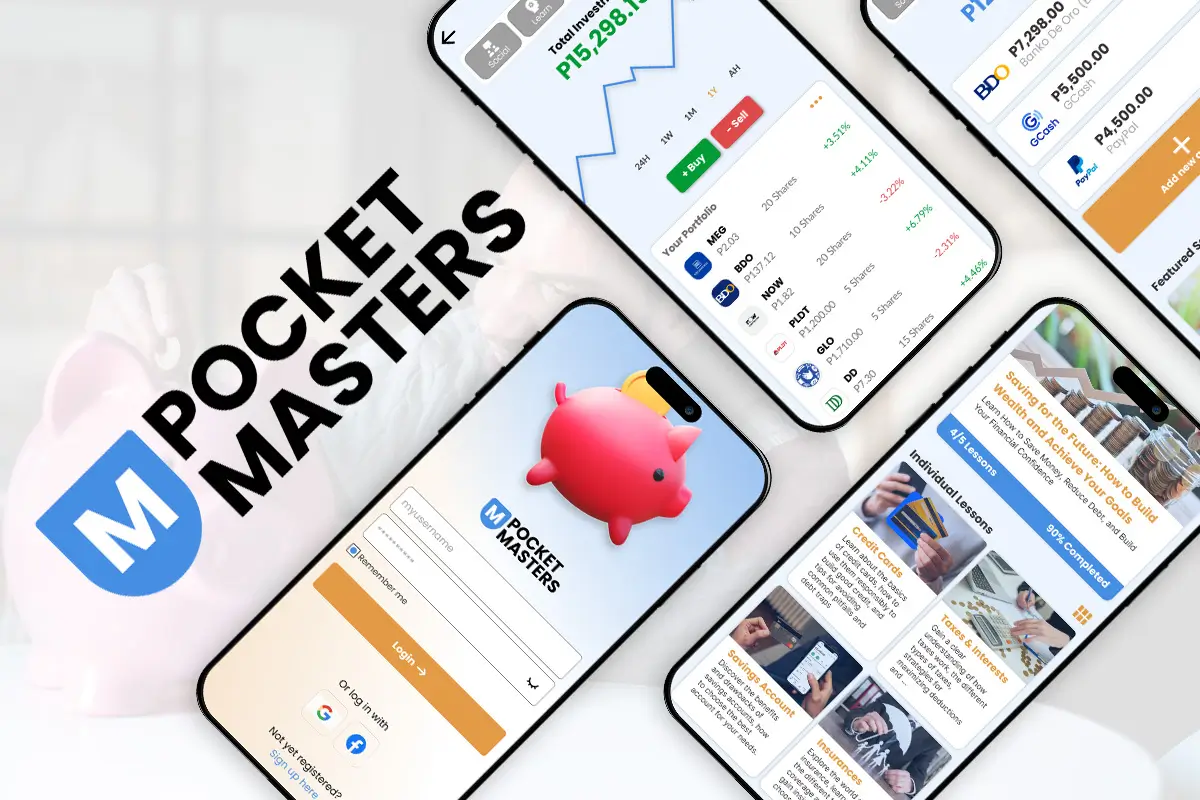
Pocket Masters is an all in one application that aims in helping Filipino Teenagers in their financial journey. Equipping them with the proper knowledge, skills, and tools before they embark their adult life with finances.
The application is made of 4 parts. The first part aims in connecting users to other users that share their interest and act as an accountability and support partner in their financial journey. The second part aims to equip them with proper knowledge about savings, investment, and other financial things that we should learn like credit cards and taxes. The third part is primarily a tool to help them track their savings. And lastly, the last part is helping them in their investment journey. Providing them with a tool that helps them track their stocks as well as keeping them up to date with the latest news about the Index and all companies under it.
The Problem
Based on my UX research, I have discovered that young generations face challenges in managing their finances for various reasons. A lack of solid foundation in their younger years affects how they manage their finances in their adulthood which results in poor financial performance.
The Goal
The Goal of PocketMasters is to connect our users to other users with similar interests and provide them an environment where they can grow their financial knowledge and skills. I also want the application to provide them with different learning resources that would help them in their financial journey as well as provide necessary tools to help them with their journey.
My Role
My role is to address the challenges faced by young generations in managing their finances. By understanding their needs and behaviors, I will design an environment that connects users with similar interests, facilitating their growth in financial knowledge and skills. I will also ensure the application provides comprehensive learning resources and essential tools to support their financial journey.
My Responsibilities
My responsibilities included conducting user interviews, creating both paper and digital wireframes, developing low and high-fidelity prototypes for testing and validation, conducting usability studies to gather user feedback, ensuring accessibility considerations were incorporated into the designs, and iterating on designs based on user insights and feedback.
Understanding the User
User Research Summary
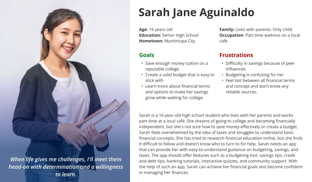
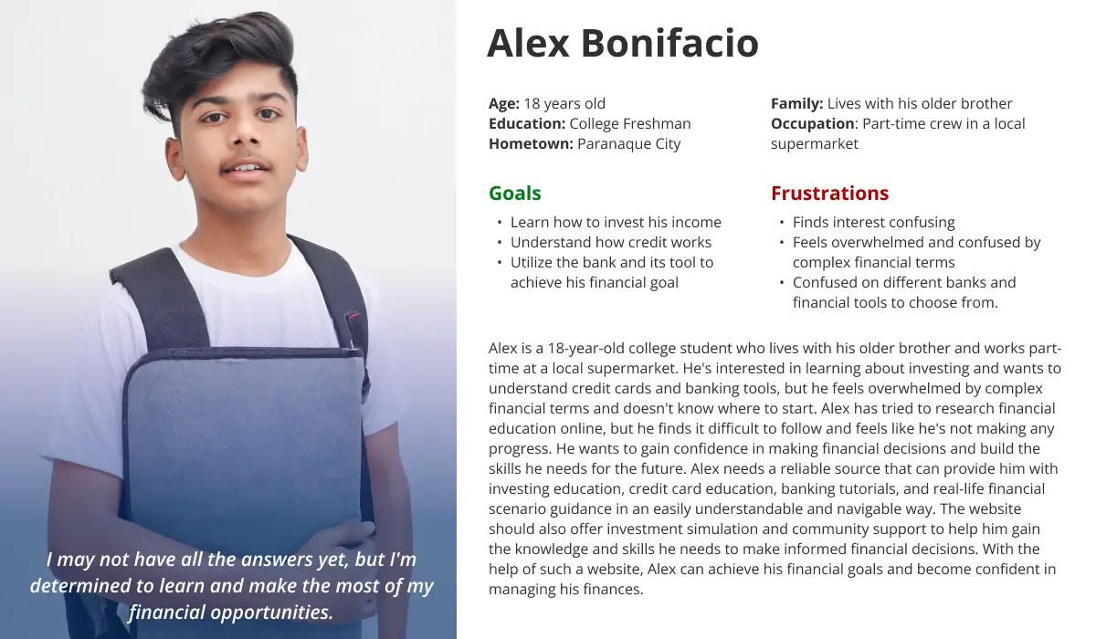
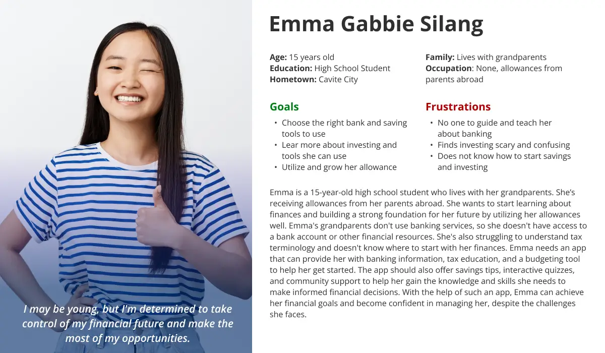
To better understand the users that I’m designing for, I conducted a quick secondary research through different reputable websites that already conducted research similar to mine. I found out that the primary reasons why Filipino teenagers are having trouble with their finances is primarily because of lack of financial accountability with their peers, lack of knowledge with different financial concepts, and difficulty in tracking their cash flow.
Minimal Financial Accountability
Teens in environments with low financial literacy and heavy social media exposure often make imprudent financial decisions, such as overspending, craving costly items, and embracing a risky financial lifestyle.
Unfamiliar with Financial Concepts
Teenagers often face challenges in financial management due to a lack of knowledge about crucial concepts like taxes, credits, and interests. This hampers their ability to make informed financial decisions and plan for the future.
Difficulty in tracking Cash Flow
Many teenagers struggle to track their cash flow due to a lack of skills in monitoring income and expenses. This results in a lack of awareness about their spending, making budgeting and wise financial choices challenging for them.
User Personas
User Journey Map
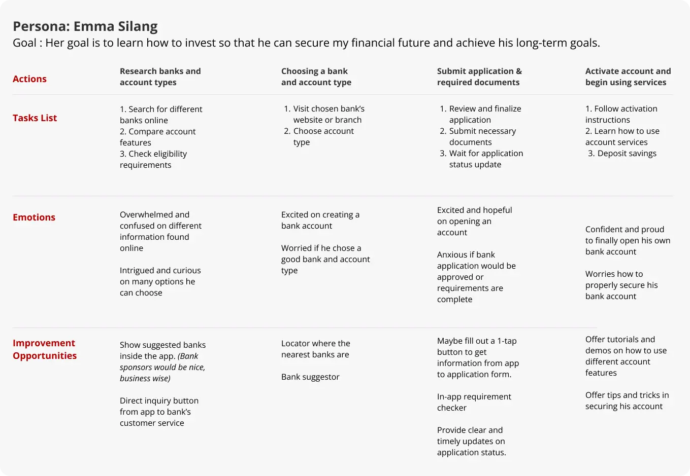
Follow Emma's journey as she sets out to open her very first bank account. Experience her emotions firsthand, from the initial excitement to moments of uncertainty. As a UX Designer, this journey becomes a valuable guide to improving the app. By understanding Emma's needs and concerns, we can enhance the user experience, making the process smoother and more user-friendly on the UX Portfolio website.
Start the Design
Paper Wireframe
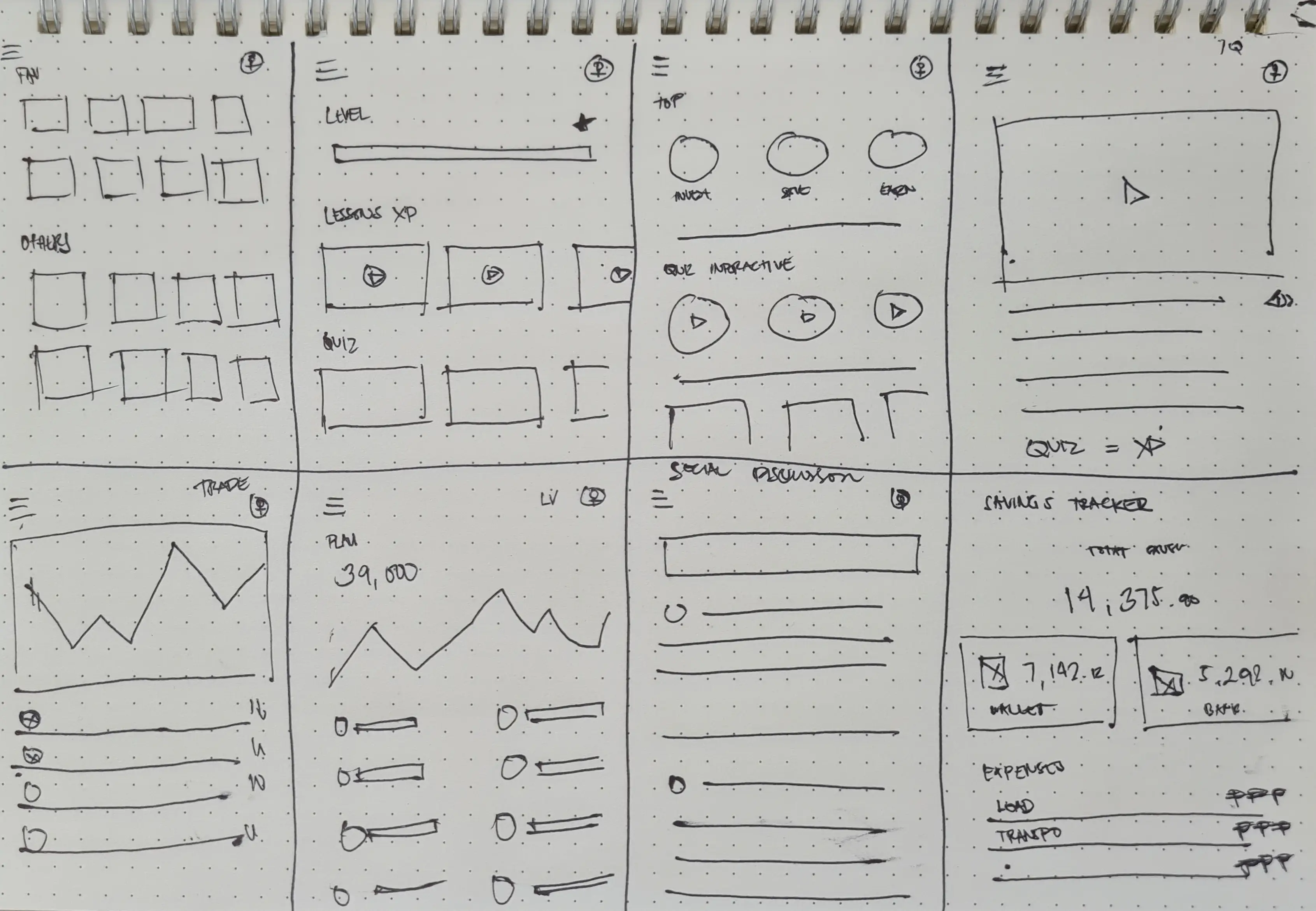
Different ideas came to my mind while visualizing different designs for the app. I later made a design which is the most familiar for users so they'll easily understand how to navigate the app. The main navigation is inspired from FB as well as adopting it’s news feed. While the other parts are from my own idea. These designs are made with the user pain points and target users in mind.
Digital Wireframes
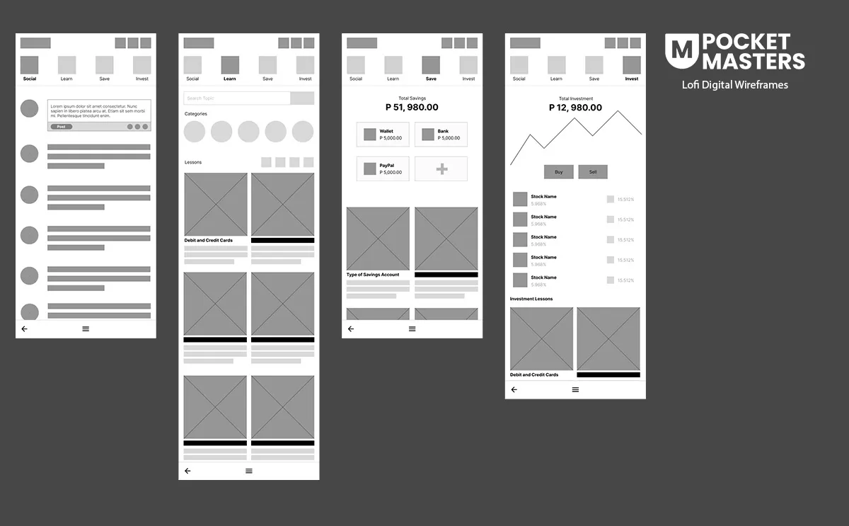
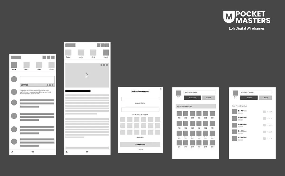
After I did a quick research and received feedback from the paper wireframe, I later on transferred the design to Figma. During the transfer, I did a few changes which will improve not only the design, but the user’s experience as well.
Low-Fidelity Prototype
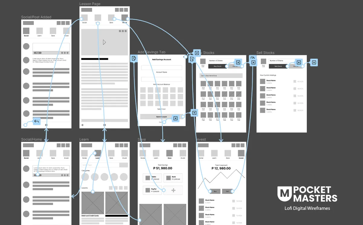
To test the user experience, I created a low-fi prototype that focused on the three main steps of the app. First is to see if the users will have any difficulty in interacting through social. Second, the users will try to complete a lesson. Third, the user will try to add a savings account, and lastly, the users will try to add and remove a stock in their portfolio.
Usability Study
I conducted 4 usability studies to gather insight from users. The goal is to see if the users was able to complete the task given to them. Tasks includes the main 4 functions of the application which are social, interaction with other users; learn, completing a lesson; save, creating a savings profile; and invest, customizing their investment portfolios.This study allowed me to identify specific areas of the design that required refinement and improvement based on the user’s feedback.
Findings
- The user successfully completed most tasks on the Social Page but expressed a desire for additional options to engage with other users.
- The presentation of lessons is confusing. Some restructuring is needed to better organize the lessons and enhance the user's learning journey.
- The user could complete most tasks, but it took longer due to the challenging learning curve associated with the navigation.
Refining the Design
Mockups
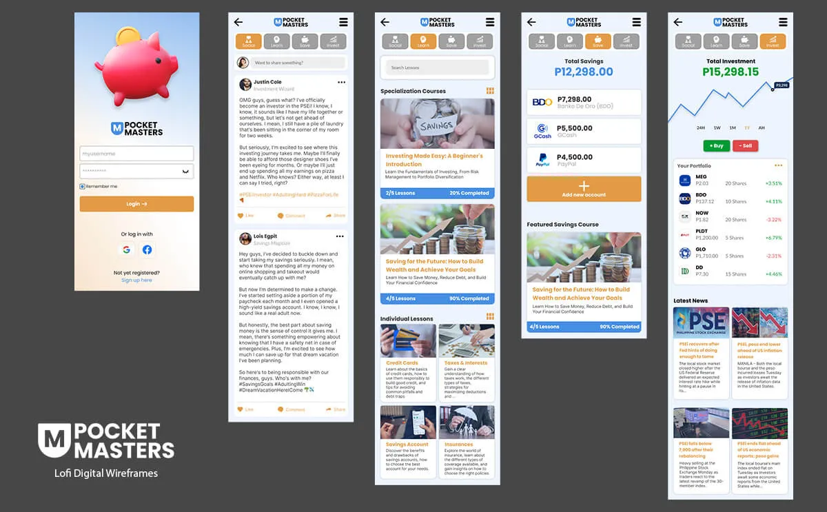
In response to the findings from the usability study I conducted, I implemented several changes to address the three main issues identified. Firstly, I enhanced user interactions by introducing additional options such as reactions and comments. Secondly, I focused on improving the structure of the lesson page to facilitate a smoother user experience. Notably, I placed Featured lessons at the top, followed by other lessons in a grid format, aiming to highlight key content. To further aid navigation within lessons, I introduced additional navigation menu for seamless movement. Thirdly, I prioritized main navigation improvements by incorporating clear iconography and a cohesive color scheme. These enhancements were designed to ensure that users can easily comprehend and utilize the navigation features, thereby creating a more user-friendly learning environment.
High-Fidelity Protoype
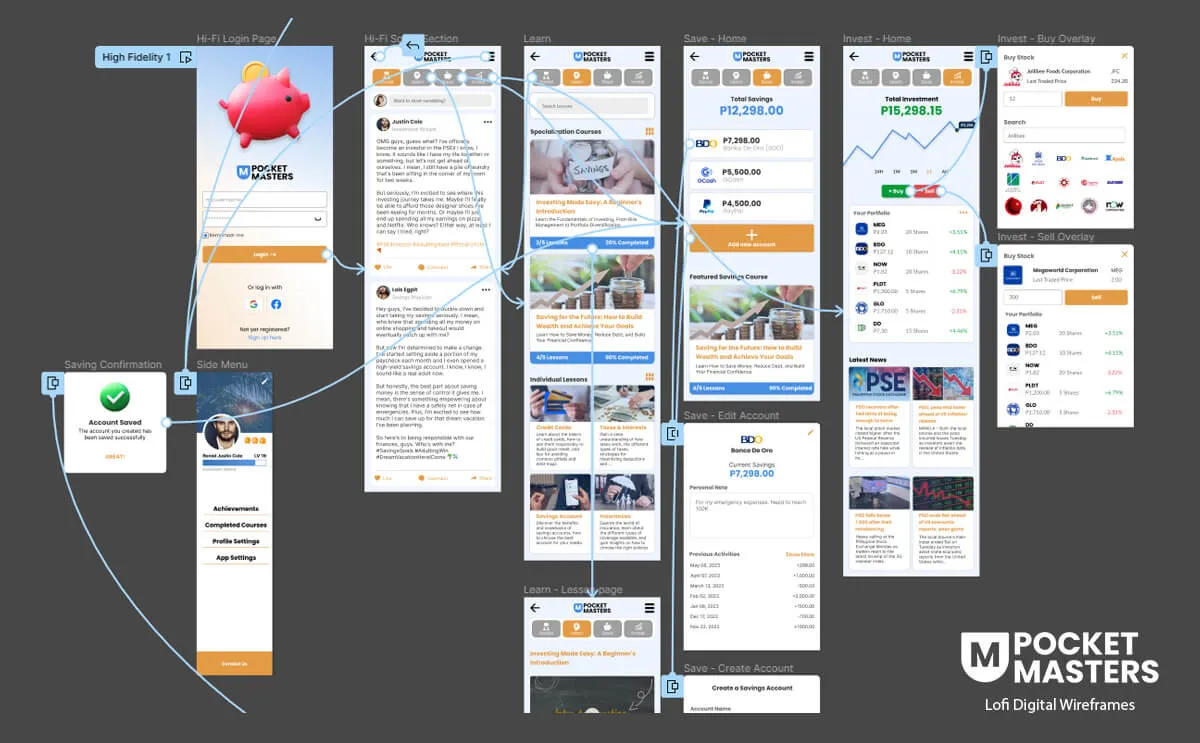
The final high-fidelity prototype in my UI/UX portfolio demonstrated cleaner user flows for ordering street foods and checkout. It effectively addressed user needs, particularly in terms of providing a seamless delivery option.
Accessibility Considerations
In every design endeavor, I prioritize Accessibility Considerations. Ensuring a seamless and inclusive user experience is at the core of my design philosophy. By implementing user interfaces that are accessible to everyone, regardless of abilities or disabilities, I strive to create digital spaces that are not only visually compelling but also universally usable.
- Provided alt text for images to support screen readers and improve accessibility for visually impaired users.
- Will add light/dark mode and adjustable contrast and text size options for enhanced user customization.
- Incorporated Tagalog/English language options to cater to a wider user base.
- Utilized intuitive icons for navigation to improve usability and familiarity.
Going Forward
The Impact
The app provides and addresses almost all of the pain points of the users in terms of their financial literacy such as lessons, saving and investment tools, as well as communicating with other users that share the same goals with them.
What I learned
One of the take-aways I got while designing the app is there are plenty of ways to help the users with their pain point. My original plan for this app is to create a learning platform only. However, during my research, I learned that it would not be enough to really help the users in their financial literacy journey, that is why other features were also considered in the design.
I also learned that doing a project with multiple functions like this one is very difficult. I find it essential to test every feature before moving to the next whenever possible. This will allow me to make changes to the design based on the user's feedback and then apply those learnings to the next feature as I design it.
The Next Steps
I'm enthusiastic about expanding the app's features with elements like games and challenges, always with a keen eye on addressing user needs. Prioritizing ongoing research allows me to tap into insights from our active user base, facilitating continuous improvements in response to their feedback and evolving preferences.
I'm also exploring the integration of AI as a built-in support system to efficiently assist users with their inquiries. Considering the often constant and detailed nature of investment information, I believe leveraging AI could markedly elevate the user experience.
